Best Practices for Visual Hierarchy in Web Design: Guiding Users' Attention

Your website competes with millions of others for precious user attention, you'll need a secret weapon to stand out. Welcome to the world of visual hierarchy! Imagine your web page as a beautifully organised buffet; your goal is to make your users want the best bits first, and then savour the rest. Here are a few tips to help you improve the structure of your website!
Prioritise Your Content
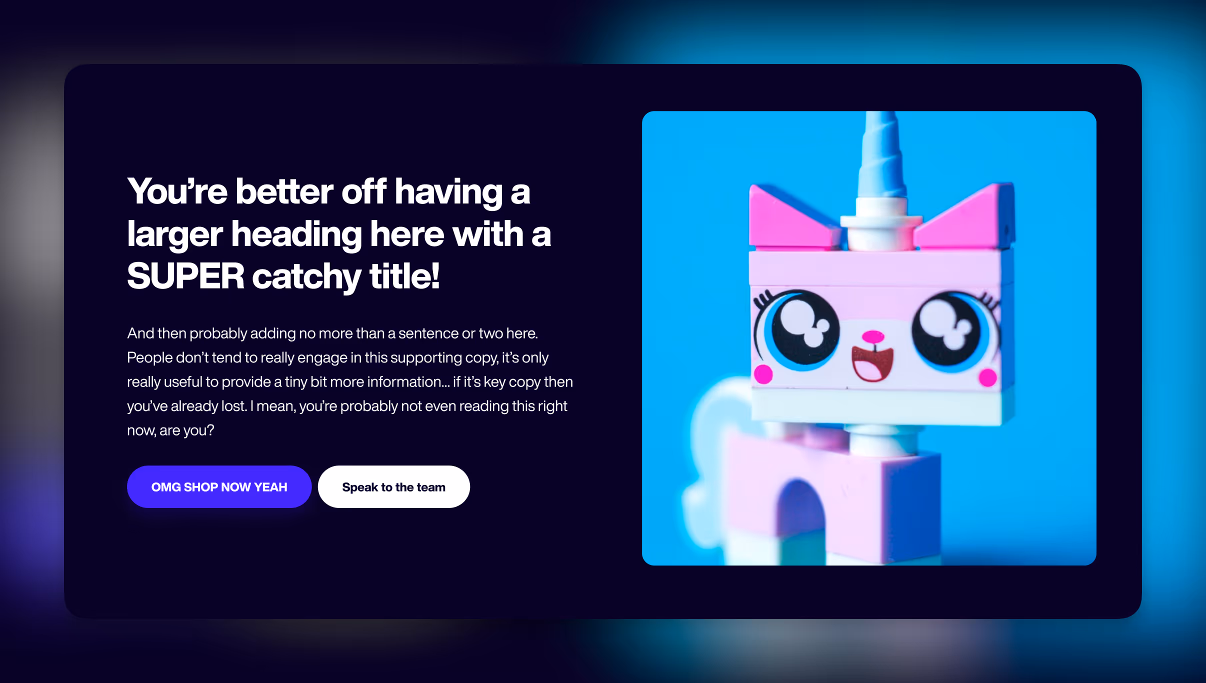
Think of your website as a storybook. What's the first thing you want your readers (or in this case, users) to see? That's your headline. It's the catchy title on the book's cover that makes people want to open it. Make it bold, captivating, and easy to spot. Remember, users usually read in an 'F' or 'Z' pattern on a webpage. Place your most important content, like a killer headline, near the top and left, and let it be the star of the show.

Size Matters
Yes, in web design, size does matter. Larger elements naturally draw attention. Your primary call-to-action (CTA), like a "Buy Now" button or a "Sign Up" link, should be big, beautiful, and impossible to ignore.
But don't go overboard – balance is key. Create a size hierarchy so that your CTA stands out, but other important elements like headings and subheadings are clearly visible too.
Play with Colours
Colours are like the spices in your web design kitchen. Strategic use of colour can lead the user's eye where you want it to go. Use contrasting colors for your CTA buttons or important information, and softer hues for secondary elements. For example, if your website's theme is mostly monochrome, a splash of vibrant colour can work wonders.
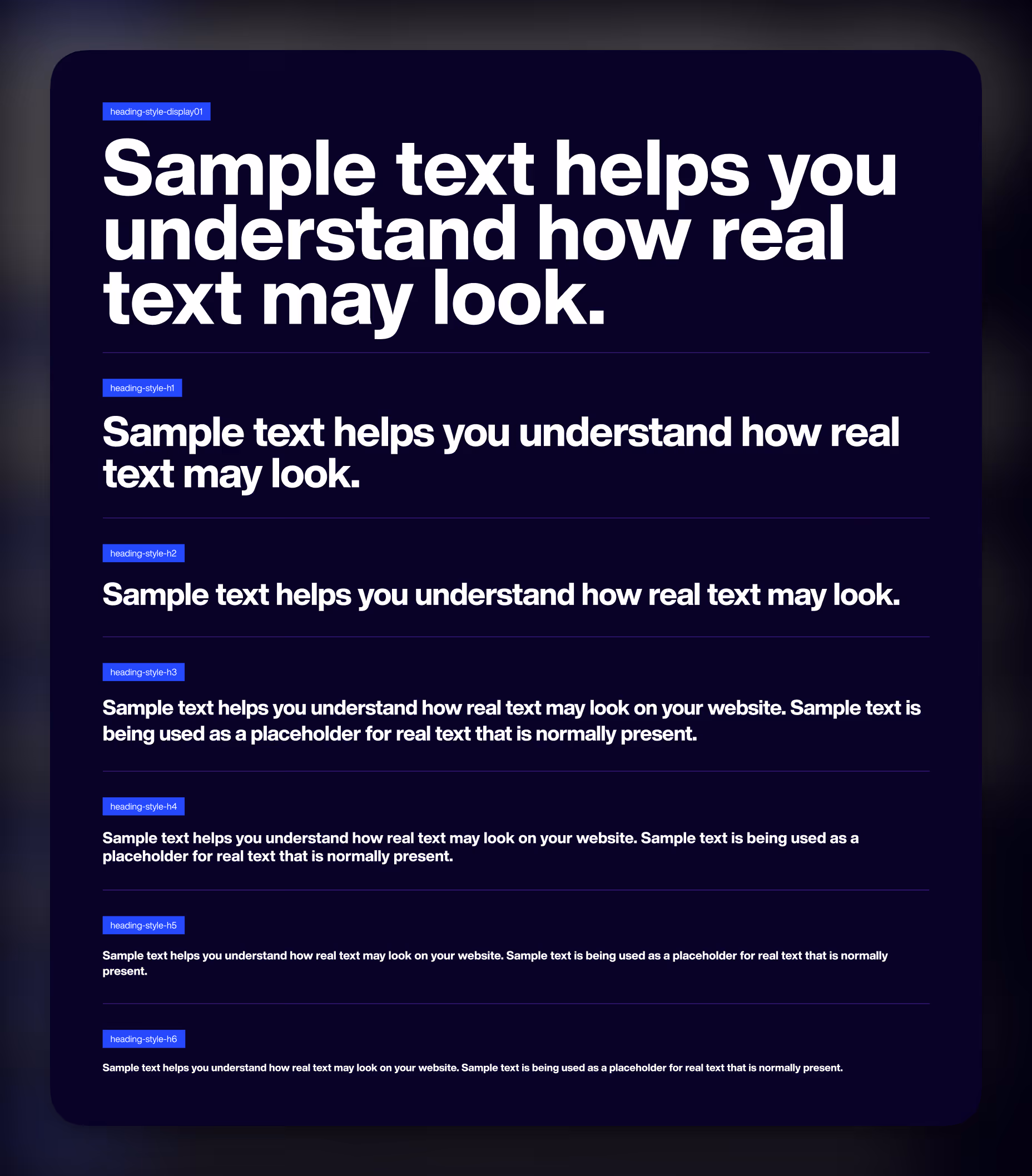
The Importance of Typography
Fonts are not just letters; they are personalities. Select fonts that align with your brand and create a consistent hierarchy using different font sizes, styles, and weights. The headline might be bold and daring, while body text should be easy on the eyes. And remember, never use too many fonts – it's like trying to speak ten languages at once.
White Space is Your Friend
In a visually cluttered world, white space is a true friend. It gives your content room to breathe and helps guide the user's eye. Surround important elements with generous white space to make them pop. It's like framing a masterpiece. Don't be afraid to give important elements on your site lots of breathing room!
Visual Cues
Think of visual cues as little signposts on your webpage. Use arrows, images, or lines to direct users' attention toward specific elements. It's like guiding someone through a maze with a trail of breadcrumbs.
Responsive Design
It's easy to forget how varied the internet is! It's essential to ensure that your visual hierarchy works on all screen sizes. What looks fantastic on a desktop might be a mess on a smartphone. Test your design on various devices to make sure it looks great everywhere. It's worth double-checking those big headings that look fantastic on desktop, those may not be so appealing on mobile if they break the site!
User Testing
User testing is your secret weapon in the quest for the perfect visual hierarchy. Get real people to visit your site and provide feedback. They'll reveal what works and what doesn't, helping you fine-tune your design.
Stay Consistent
Consistency is the glue that holds your visual hierarchy together. Keep your design elements, such as buttons and headings, consistent throughout your site. Users shouldn't have to relearn your website's language as they navigate.
Less is More
Sometimes, the best way to guide attention is by simplifying your design. Fewer elements, cleverly arranged, can be more effective in catching the user's eye. Don't overwhelm your users with too much information; leave some room for curiosity.
Remember, web design is an evolving art, and there's always room for improvement. Be open to experimenting, and don't be afraid to take inspiration from websites you admire. Keep these best practices in mind, and you'll be well on your way to creating web experiences that dazzle and delight your users. If you need a hand with your website, don't be afraid to get in touch!
Subscribe to receive weekly tips, advice and knowledge on growing your business online
Before you commit to anything
Not sure where to start? The 4C Growth Diagnostic takes eight minutes.
Twenty questions. A scored breakdown across all four pillars, Clarify, Craft, Convert, Continue. You will finish with a clear view of which part of your business is holding the next stage back, a priority for where to focus first, and a free resource that addresses your specific gap directly.
There is no pitch at the end. If the output is useful, you have something to act on today. If it is not, you have lost eight minutes.