I went to OFFF Barcelona. Now I want to quit my job. (And also never quit my job.)
Last week I was in Barcelona for OFFF, three days at the Disseny Hub with some of the best creative studios on the planet presenting their work, their thinking, and their process.
It was probably the most inspired I've felt as a creative in a long time. It also made me briefly consider becoming an investment banker.
Both of those things are true at the same time.
That feeling, the dizzying mix of inspiration and imposter syndrome, is actually a sign you're in the right room....apparently at least. Here's what I took away.
The best branding doesn't look like branding
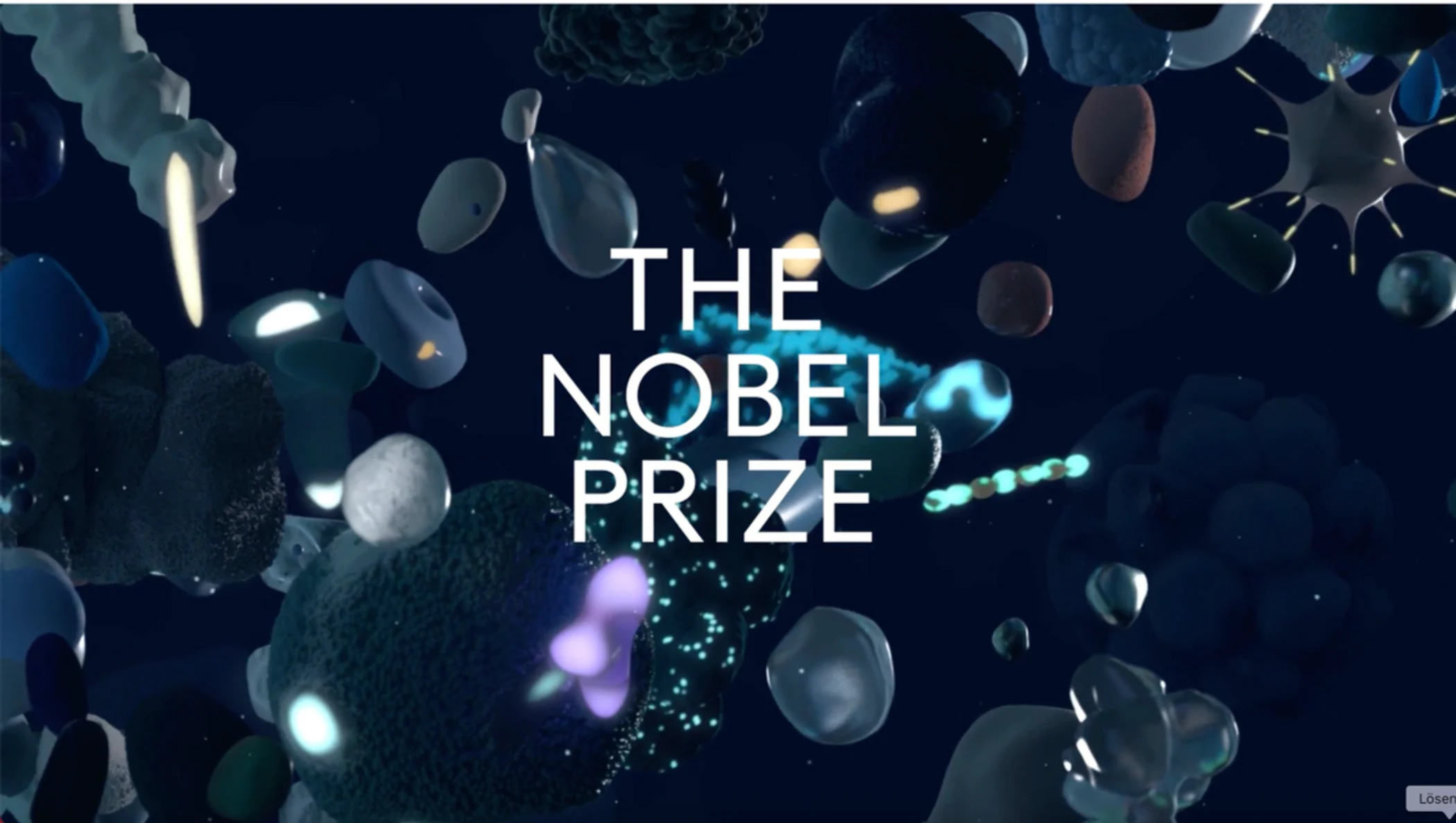
Nils Leonard's team at Uncommon did one of the best pieces of brand creative I've ever seen. They took DNA samples from creatives and used the resulting organic, cellular structures, those growing, branching spore-like forms, as the visual identity of the entire OFFF show itself.
It wasn't a logo. It wasn't a typeface choice. It was a system built from the actual biological material of the creative community it was representing. Plus it was so fucking cool.

That's the bar. Not "does it look good", but "does it mean something, and does the meaning live inside the form itself?"
It's a question I'm bringing back to VisionaryGrid. Every brief we take on, the first thing we have to ask is: where's the DNA? What's the truth about this business or this brand that we can build a system from, not just decorate on top of?
Looking back is how you move forward
My favourite single piece of work from the whole show came from Tosh Hall at JKR. The White Wimbledon Stella Artois can.
It's deceptively simple. A clean white can with restrained, considered typography, but it works because of where it comes from. JKR's process was rooted in Wimbledon's archive. The heritage, the visual language, the specific cadence of how the tournament has always communicated. They didn't modernise the brand. They distilled it.

There's a lesson here for every data firm or consultancy that thinks rebrand means starting fresh. It rarely does. The strongest brands are the ones that find their own lineage and get more precise about it, not less.
Simplicity is a skill, not a default
Björn Kusoffsky at Stockholm Design Lab showed work that's almost uncomfortable to look at if you're used to the design industry's constant compulsion to add more.
What struck me wasn't just the work, it was how they explained it. The confidence of the presentation and their precision of the language. It just reeked of confidence. Absolute God-tier designing.
That's the thing about simplicity that most people miss: it's harder than complexity. Complexity is easy to hide behind. Simplicity requires you to actually know what you're doing and why.
It's also what separates studios like SDL from businesses cycling through Canva templates or AI-generated logos that all look vaguely the same. Not because AI or Canva are evil, but because tools without thinking behind them produce outputs without meaning behind them. The market sees it. Enterprise buyers especially see it.
Frameworks can hold entire cities
Alex Lampe and Benji Wiedemann at Wiedemann Lampe showed branding work at a scale that genuinely stopped me. They've built systems for...wait for it, entire fucking cities. Frameworks that have to work across architecture, wayfinding, culture, and commerce simultaneously. It was SO incredible.

The lesson isn't just about scale. It's about rigour. A branding framework for a city has to be so clearly defined, so internally logical, that it can be applied by hundreds of people across dozens of contexts without losing coherence.
That's exactly the thinking we apply at VisionaryGrid, just pointed at consultancies and data businesses rather than city districts. The Grid part of our name isn't decorative. It's the commitment to systems that hold under pressure, that scale without falling apart, that give clients something they can actually run with.
Snask reminded me this job is actually brilliant
And then there were Freddie and Erik from Snask, who walked on stage and basically reminded everyone in the room that we're incredibly lucky.
Snask make work that's genuinely joyful. Loud, colourful, human, and clearly made by people who love what they do. Their whole ethos is that good work should be fun to make, and that the fun shows up in the output.
I needed that. After a few hours of world-class portfolio presentations that made me quietly question my career choices, Snask were the reset. A reminder that the reason most of us got into this wasn't to be serious and impressive — it was because we genuinely love making things.
We're building more of that into how we work at VisionaryGrid. Not in a way that undermines the rigour or the outcomes — but because the process of building a brand or redesigning a website should feel good. It should have energy. Clients notice when work is made with care and enthusiasm. It shows up.
What I'm bringing home
Three days. Countless studios. A lot of very good coffee and one moment of genuine panic watching Uncommon's DNA piece unfurl on screen.
But mostly, a fresh take about what great creative work actually looks like. About the gap between businesses investing in thinking versus businesses investing in output. About where VisionaryGrid is heading and the kind of work I want us to be doing.
The studios at OFFF aren't doing something mystical. They're doing the same things we're all doing, just with more conviction, more system, and more commitment to the work meaning something.
That's replicable. That's the direction.
Tom is the founder of VisionaryGrid Studio, a brand and web design consultancy that helps consultancies and data firms communicate their value to enterprise buyers. If any of this resonated, let's talk.
Subscribe to receive weekly tips, advice and knowledge on growing your business online
Before you commit to anything
Not sure where to start? The 4C Growth Diagnostic takes eight minutes.
Twenty questions. A scored breakdown across all four pillars, Clarify, Craft, Convert, Continue. You will finish with a clear view of which part of your business is holding the next stage back, a priority for where to focus first, and a free resource that addresses your specific gap directly.
There is no pitch at the end. If the output is useful, you have something to act on today. If it is not, you have lost eight minutes.