Your website isn't "not working." You're almost certainly just asking for a sales call too early

If your website gets visitors but no leads, I'd almost certainly put money on it not being a traffic problem. And it's almost certainly not a design problem either. What it usually is and I see this all the time is what we call the 'next-step' problem.
Someone gets referred to you. They click through to your homepage, skim it for about twenty seconds, and leave. This is because the only thing you've given them to do is to book a call ...and for someone who's just landed on your site cold, that's a lot to ask. They don't know you yet, right?
The frustrating bit is that the usual response makes things worse. Pipeline feels lumpy, so you start tinkering. New copy, different headline, maybe a rebrand, maybe ads. Activity goes up. Qualified leads don't. That's the guesswork loop, and once you're in it, it's genuinely hard to get out, because nothing's being measured and you've got no way of knowing what's actually moving the needle.
Most business websites are basically just expensive magazines
Most business sites are credibility artefacts, not lead systems. They look professional. They've got case studies, decent branding, maybe even some SEO traction. But they don't guide a prospect through a decision, they present information and leave people to figure out the rest on their own.
The only exit is "contact us" or "book a call." Full stop.
That structure fails precisely the kind of buyer you actually want, senior, busy, careful with their time, and a bit guarded because they've probably been burnt before. These aren't people browsing for information. They're evaluating whether you're the right choice. And if your site creates any doubt or friction at that moment, they'll do what busy people always do: they'll leave and tell themselves they'll come back to it. They won't.
What these people are really buying isn't a website or a brand refresh. They're buying control. Relief from the feeling that their site makes them look a bit "amateur" while competitors look like the obvious choice. So if your site isn't giving them that confidence quickly, the design doesn't matter.
Why "Book a call" is the wrong thing to do
"Book a call" sounds completely reasonable. Everyone uses it but...that's sort of the problem.
From a prospect's perspective, booking a call means committing time they don't have to a conversation they're not sure they want. It means potentially getting pitched. It means having to explain their whole situation to someone who might not even get it. The risk feels high, the clarity feels low, so they do what rational people do. They leave.
This is why you can have decent traffic, solid referrals, and good content, and still feel like nothing converts consistently. You're pouring attention into a bucket with no low-risk way out. The only exit is a big commitment, and most visitors aren't ready for that yet.
You need to give people a smaller 'yes' first
The goal of your website isn't to get everyone to book a call. The goal is to move the right people one step closer, with enough momentum that they actually get there.
That means you need a safe first step. Something a qualified prospect can do without feeling like they've walked into a sales situation. Depending on your market, that might be a diagnostic, a scorecard, a short application, a paid discovery session. The format matters less than the psychology: reduce perceived risk, increase understanding and then give someone an obvious next step that matches where they are right now. That's what separates a lead system from a brochure.
What this looks like in practice, Amberton
Amberton came to us operating in the asset management space. Conviction-led investment model, high-trust client relationships, proper expertise. But their brand and website weren't reflecting any of that. They were getting leads, just the wrong ones. Mismatched enquiries, diluted authority, conversations that started in the wrong place.
The issue wasn't their offer. It was that the site wasn't built to attract the right kind of buyer and filter out the wrong ones. So we went back to first principles. Defined their ideal client profiles properly, improved their messaging, mapped the partner journey, and rebuilt the brand and website to actually reflect how they work and who they work with.
The result was an 82.35% increase in engagement rate,, but more importantly, fewer leads that were far better qualified. Stronger inbound conversations. Internal clarity about who they were talking to and why. A brand that now mirrors the high-trust model they'd always operated to.
We're still working with them now, which is usually a good sign.
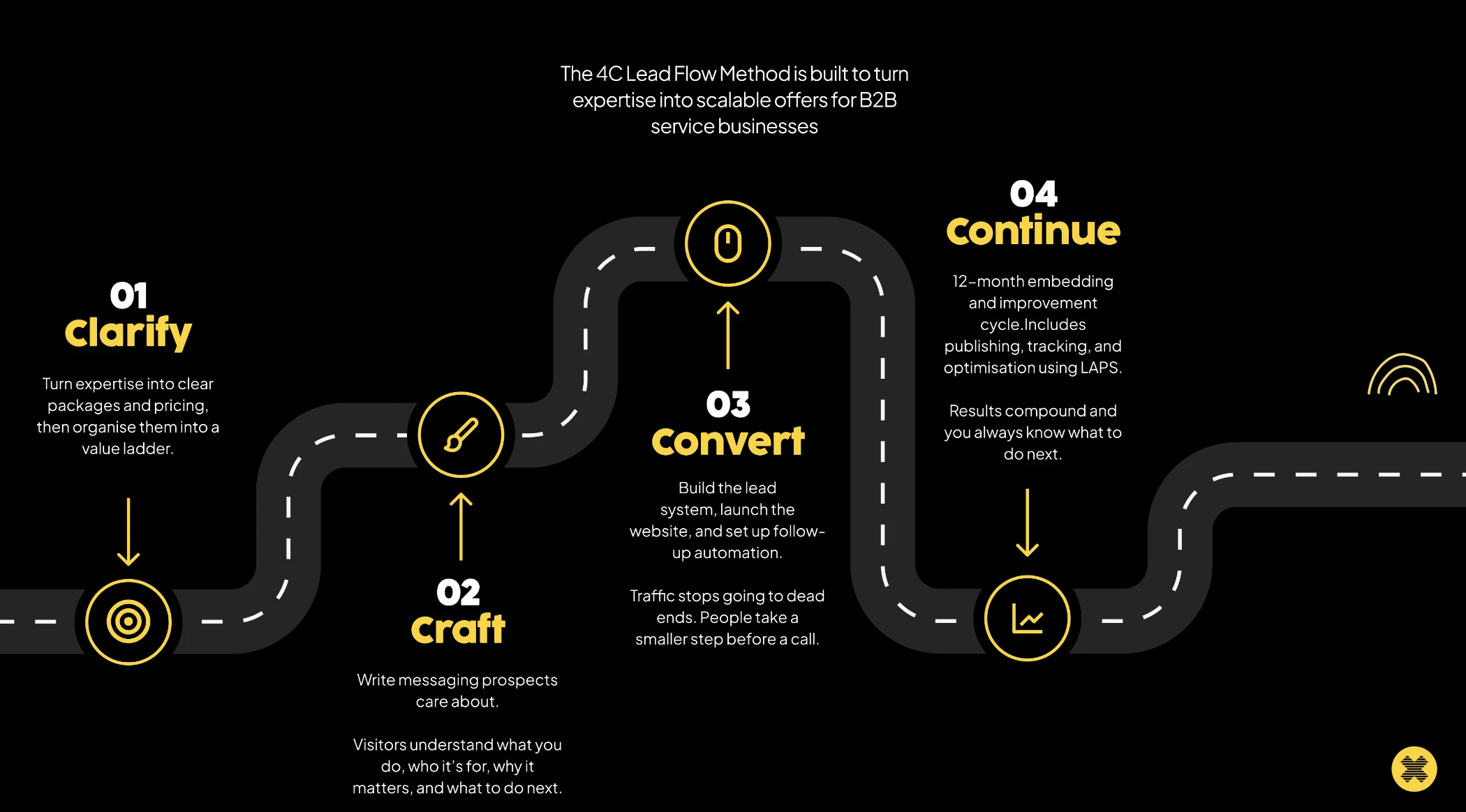
The system behind it: Clarify, Craft, Convert, Continue
Every project I do runs through the same four stages, and most businesses are missing at least two of them.
Clarify is about getting your offer out of your head and into a format a prospect can actually navigate. Most founder-led businesses explain what they do the way they'd explain it to a peer — not the way a buyer makes a decision. The fix isn't better copy first. It's offer clarity. What are the two or three core problems you solve? Who are the buyers you win consistently? What can you credibly promise? Get that clear, build it into a value ladder, and suddenly your site has somewhere to take people.
Craft is your messaging. Most service sites lean on what I'd call fake differentiators, "bespoke," "we care," "tailored solutions," "15 years of experience." None of that helps a prospect choose you over anyone else. Your messaging has to make the problem feel specific, the outcome feel tangible, and the next step feel safe. A decent test: if someone only reads your headline, subheading and CTA, do they know who it's for, what changes for them, and what to do next? If not, they'll bounce.
Convert is where most of the leakage happens silently. Blog posts that end with nothing. Service pages that describe but don't direct. Homepages with five competing buttons. Every page needs a job, and that job is to answer one question: what should a qualified person do after reading this? And then — the bit almost everyone skips — follow-up automation. If someone takes that small first step, you need a short sequence that delivers what they asked for and invites them to the next one, without pressure. That's how attention becomes leads.
Continue is what makes it compound. Websites fail when they're treated as one-off rebuilds. You launch, feel good for a week, and then nothing changes because nobody's tracking the right numbers. Pick five metrics, review monthly, make one focused improvement at a time. That's what "predictable pipeline" actually means — you know what to change next.
The fix isn't a redesign. It's a path.
Your problem isn't that prospects aren't interested. It's that your website is asking for a big commitment before you've earned it. Sort that — give people a clear, low-risk first step, build a path they can follow, track what's happening, iterate, and everything else gets easier. Referrals convert more often. Content performs better. You stop spinning in the "what do we change next?" loop.
Build the system. Not the brochure.
If you want to know where yours is leaking before you spend another penny on traffic or design, complete the Diagnostic and I'll take a look at your homepage and main service page and tell you exactly where the gap is.
Subscribe to receive weekly tips, advice and knowledge on growing your business online
Before you commit to anything
Not sure where to start? The 4C Growth Diagnostic takes eight minutes.
Twenty questions. A scored breakdown across all four pillars, Clarify, Craft, Convert, Continue. You will finish with a clear view of which part of your business is holding the next stage back, a priority for where to focus first, and a free resource that addresses your specific gap directly.
There is no pitch at the end. If the output is useful, you have something to act on today. If it is not, you have lost eight minutes.