Paylolly
A payment platform whose site was costing it the sale before anyone saw the product.

A platform built on speed, sold by a site that was anything but.
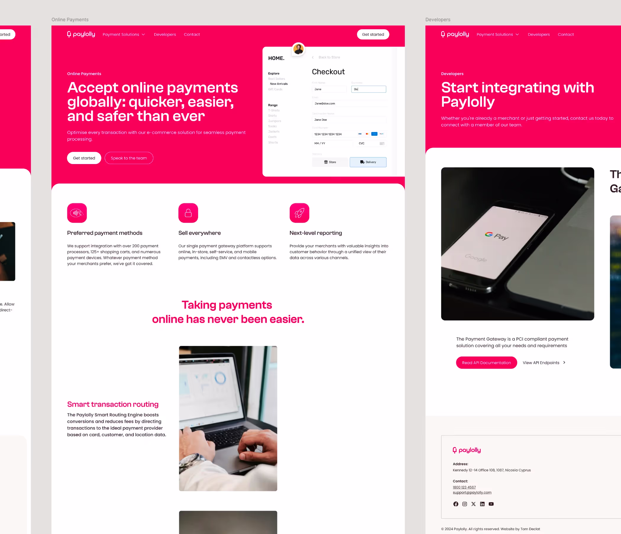
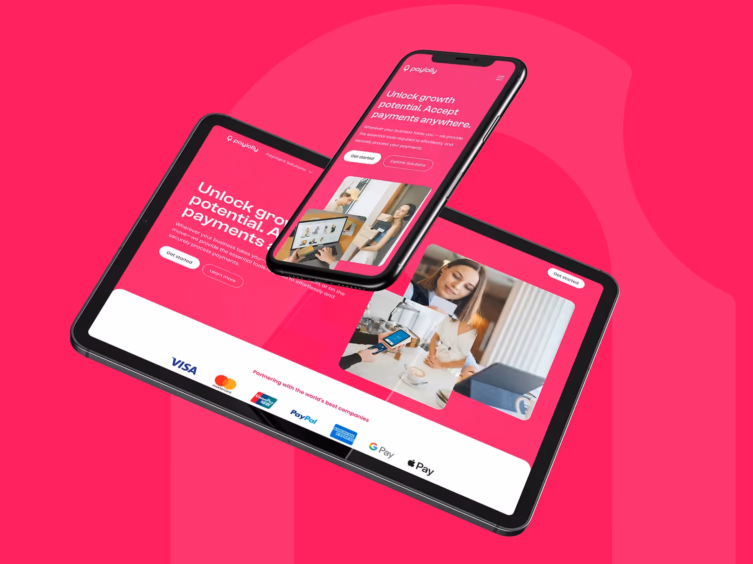
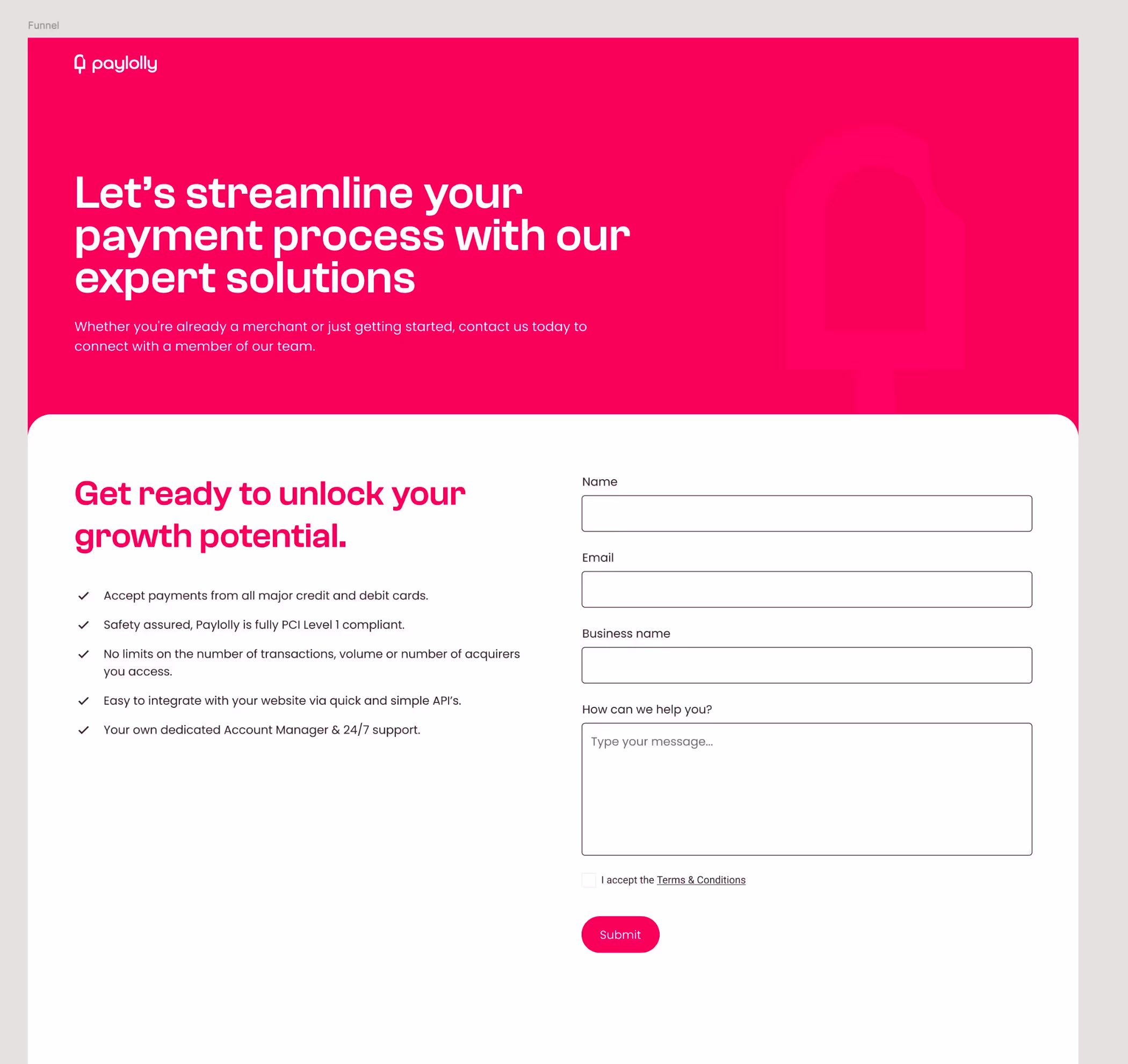
Paylolly had built a payment solution with a genuine proposition — fast, simple, suited to businesses that couldn't afford friction at the point of transaction. The product delivered on its promise. The site didn't. Slow load times, no mobile-first thinking, and a journey that offered no clear path from arrival to sign-up meant visitors bounced before they ever understood what they were looking at. For a business built on the idea that transactions should be effortless, the irony was expensive.
The fix wasn't cosmetic. It required rebuilding the user journey from the point of arrival — making clear what Paylolly does in the first three seconds, and ensuring the next step was obvious from every page. The design borrowed its sensibility from the product itself: fast, uncluttered, nothing in the way.
Engagement and conversions improved immediately after launch. The site now works as hard as the platform it's selling.
Delivered: brand identity, messaging, UX and visual design, website.
Breaking it down in numbers
increase in conversions
increase in engagement rate
increase in visitors

“Our new site has attracted more visitors and massively increased our engagement and conversions. Working with Tom was a game-changer for us; he's not just a consultant, but a pivotal partner in our ongoing success.”


Before you commit to anything
Not sure where to start? The 4C Growth Diagnostic takes eight minutes.
Twenty questions. A scored breakdown across all four pillars, Clarify, Craft, Convert, Continue. You will finish with a clear view of which part of your business is holding the next stage back, a priority for where to focus first, and a free resource that addresses your specific gap directly.
There is no pitch at the end. If the output is useful, you have something to act on today. If it is not, you have lost eight minutes.